Set and Parameter Actions and Viz In Tooltip
Add life to your vizzes and make it easier on the user by using set and parameter actions and viz in tooltip
Set Actions
Set actions added to the dashboard are an easy to use alternative to drop down filter. In the dashboard below - the map provides a visual way for users to select the state or regions to be included in the YoY and subcategory Ranking
Create a set on State - use select All - the set action will change that later
For use in the YoY and Ranking worksheet you will need a parameter for the end year - (Note for this example I just used full year sales - the approach will work with YTD sales also)
Then LODs for current and prior year sales are needed (Note I included Segment for use in the viz):
Current Year:
{ FIXED [Segment] :sum({ FIXED [Order Date],[Segment],[State]:zn((
if year(min([Order Date]))=([3 Enter end year]) and MAX([3 select state for rank])
then sum([Sales]) end ))} )}
Prior Year:
{ FIXED [Segment] :sum({ FIXED [Order Date],[Segment],[State]:zn((
if year(min([Order Date]))=([3 Enter end year]-1) and MAX([3 select state for rank])
then sum([Sales]) end ))} )}
And YoY sales growth is are:
(sum([3 TY Sales])-sum([3 LY Sales]))/sum([3 LY Sales])
Add an LOD to rank the subcategories
{ FIXED year([Order Date]),[Sub-Category],[3 select state for rank]:
sum(if [3 select state for rank] and year([Order Date])=[3 Enter end year]
then [Sales]end )}
An finally Rank the subcategories using
RANK_UNIQUE(sum([3 LOD sales by state for rank]),'desc')
and a filter
[3 rank states ]<= [3 N for top N]
Create 3 worksheets:
YoY Growth by Market Segments:
Subcategory Rank
and the Map is a simple filled map
Then bring the together on a dashboard
Add a set action to the Map to change the State Set based on a visual selection from the dashboard
And the User can now select states or regions directly from the map and the YoY growth and subcategory ranking will adjust accordingly -
Parameter Actions
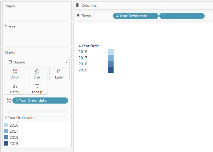
Parameter actions work just like set actions except parameters are single valued and allow users to select that value visually from a value picket on the dashboard -
Using the same model as above add a value picker and a parameter action to change the Select End Date Parameter. You can be more elaborate - I just used a simple square chart on a worksheet to make the Value Picker
Add the Value Picker and a Parameter action to the dashboard
and you are done:
That's only scratching the surface of using set and parameter actions to replace drop down menus - have some fun with them and see - you can't break anything-
Viz in Tooltip
When Viz in tooltip was introduced in 10.5, it was interesting but I didn't realize that it was a such game changer -
If you haven't used them, Viz in tooltip is a function that will bring an image of the filtered results from another worksheet into the tool tip when the user hovers or click on a mark. It works like a filter action passing dimension values from the first sheet to the second then returns an image (note: a PNG that is not interactive) to the tooltip.
Lets see how it works
Create 2 sheets - the first a simple sales by category bar chart
and a profit map
The goal is to show the filtered profit map when hovering over a segment on the bar chart. Open the tootip tile, then select Insert, then Sheet - then select the sheet you want
And it returns this
Let's see what is going on - when you set up the tootip, Tableau first added a text string into the tooltip
The sheet name is in quotations, the max width and height are the size of the image in the tool - you can overwrite the value to resize the image as needed and the dimensions to be filtered on the second sheet - Here All Dimensions from the first sheet are applied to the second sheet (Map) before the image is returned - You specify field you want filtered as shown
Tableau also creates an action filter on the second sheet (Map) based on the filters passed
That was easy - I've used Viz in tooltip as shown, to bring back the next lower level data from a hierarchy and like a lookup function to bring back specific information on a specific item from a long detailed text table (only the detail table is ugly but I am the only one who sees it - the user just sees the filtered data)
The 2 examples that follow were derived from her presentation - Only hope to do them justice
First - the "Dashboard in Tooltip" - is not literally copy a dashboard in the tooltip but building one from several worksheets.
Three worksheets - Sales, Top N and Sales Growth are going go be added ion a single tooltip
The 3 worksheets are inserted in the tooltip as before - a blank sheet is added to draw a line to separate the views (you will to copy and paste the text)
Hovering over a state applies filters to 3 worksheet and brings the results to the tooltip -
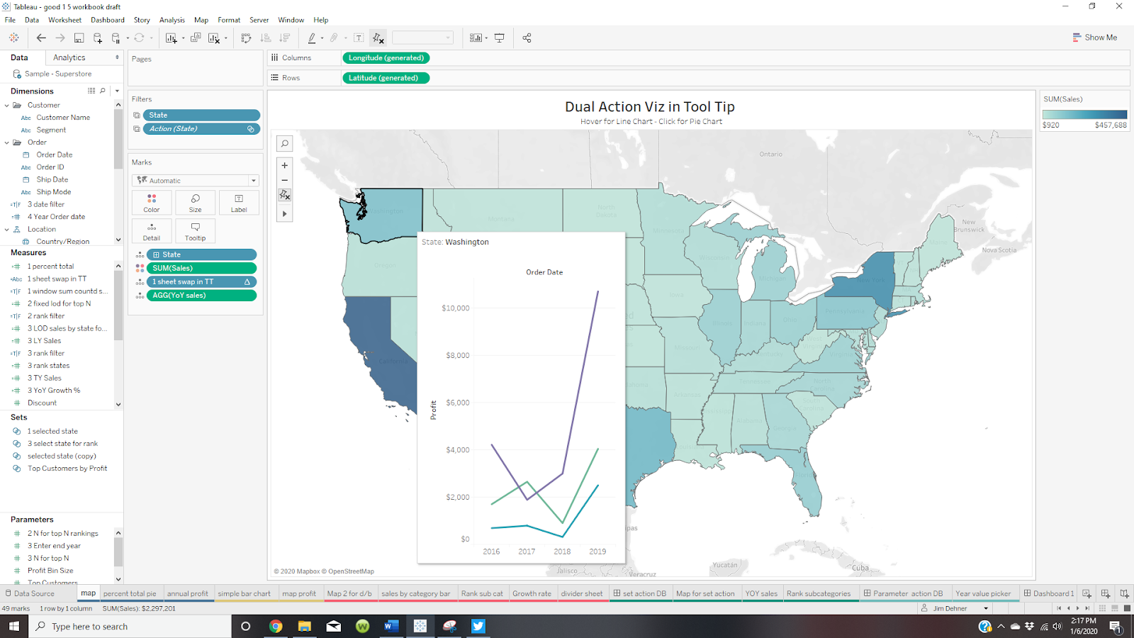
The last example shows how to see one view in the tooltip on hover but something entirely different when the marked is "clicked" - it is requires several calculations and filters
Hover returns this
Selecting a state with a click returns this:
Hover does not select a state so the count of all states in the view is 49 (Sorry Alaska). Selecting a state with a click reduces the number to 1 - so we can use a distinct count of states across the view (Window_count) to determine the view we want to see
If the Boolean below is True - we want to see the Pie Chart - if False we want the Line Chart
Window_sum(countd([State]))=1
Tooltips don't accept calculations - but this will "Sheet Swap" based on the state count
CASE [1 window sum countd state tf]
when TRUE then '<Sheet name="percent total pie" maxwidth="300" maxheight="300" filter="<All Fields>">'
when FALSE then '<Sheet name="annual profit" maxwidth="500" maxheight="500" filter="<All Fields>">'end
Just need one more thing - hovering does not select a single state - there are still 49 states in the view. We need to pass a single state to the Annual Profit sheet - for that we need a set and set action
Create a set
and a set action
Then create the viz
On the Profit sheet add a set action filter
On the Map apply the click action to the Pie chart only
And you are done
Fee free to download it an use it as a model
Enjoy
Jim